
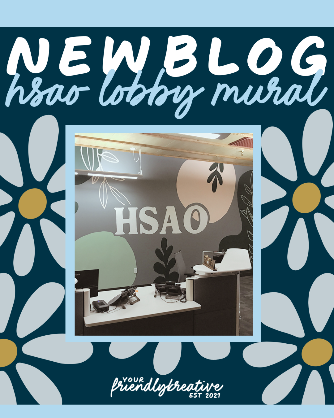
Human Services Administration Organization Mural
“We want something refreshing…sometimes our job isn’t the lightest. It would be nice to walk in and it feel calming. - like a breath of fresh air…”
Refresh is the word of this project. It was the word the team kept coming back to during our initial meeting. This wall is the first thing you see when you walk into the space - we wanted to find a balance that was inviting and alluded to the business, but more so acted as a change in scenery for the employees who work there.
The Initial Meeting
I see it as my job to be “the listener” during any initial meeting I take. I want to hear and learn about you (via the things you say and the things I observe). Tell me your vision, the things you love, the things you hate, and the things that inspire you. Tell me all of your ideas, and I’ll do what I can to make them work cohesively and aesthetically.
The team talked about themes such as “graffiti tags,” abstract nature, and lettering. Along with the keyword “refresh,” peaceful, and calming were other descriptors being used. In terms of color palette, the team wanted something more light, yet bright and gender-neutral.
First Presentation
Based on our initial meeting, I came up with a few different variations of what we could do. As with all of my meetings, I present these concepts and drafts as direction starts. These starts are just that, starting off points that we refine from there.
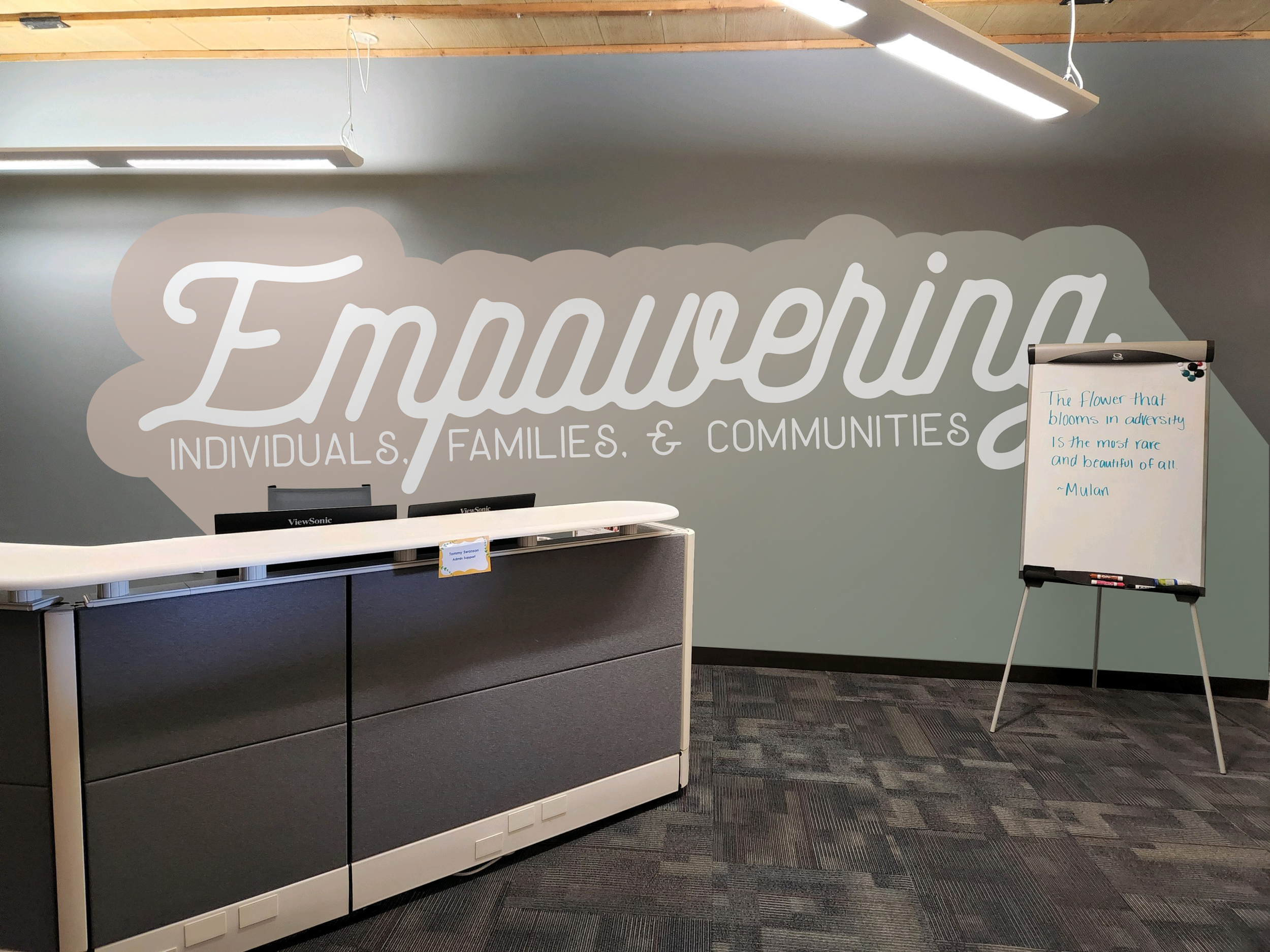
The first concept was an ombré, “simple lettering” style mural. At the time, I took a phrase from the HSAO mission statement and pieced it together as a powerful reminder of what the team is helping to foster in our local area (if the team chose this concept, spoiler, they didn’t, we would have word-smithed that phrase with something the team came up with). The color palette was based in earth tones - greens and browns on the already slated “steel.”
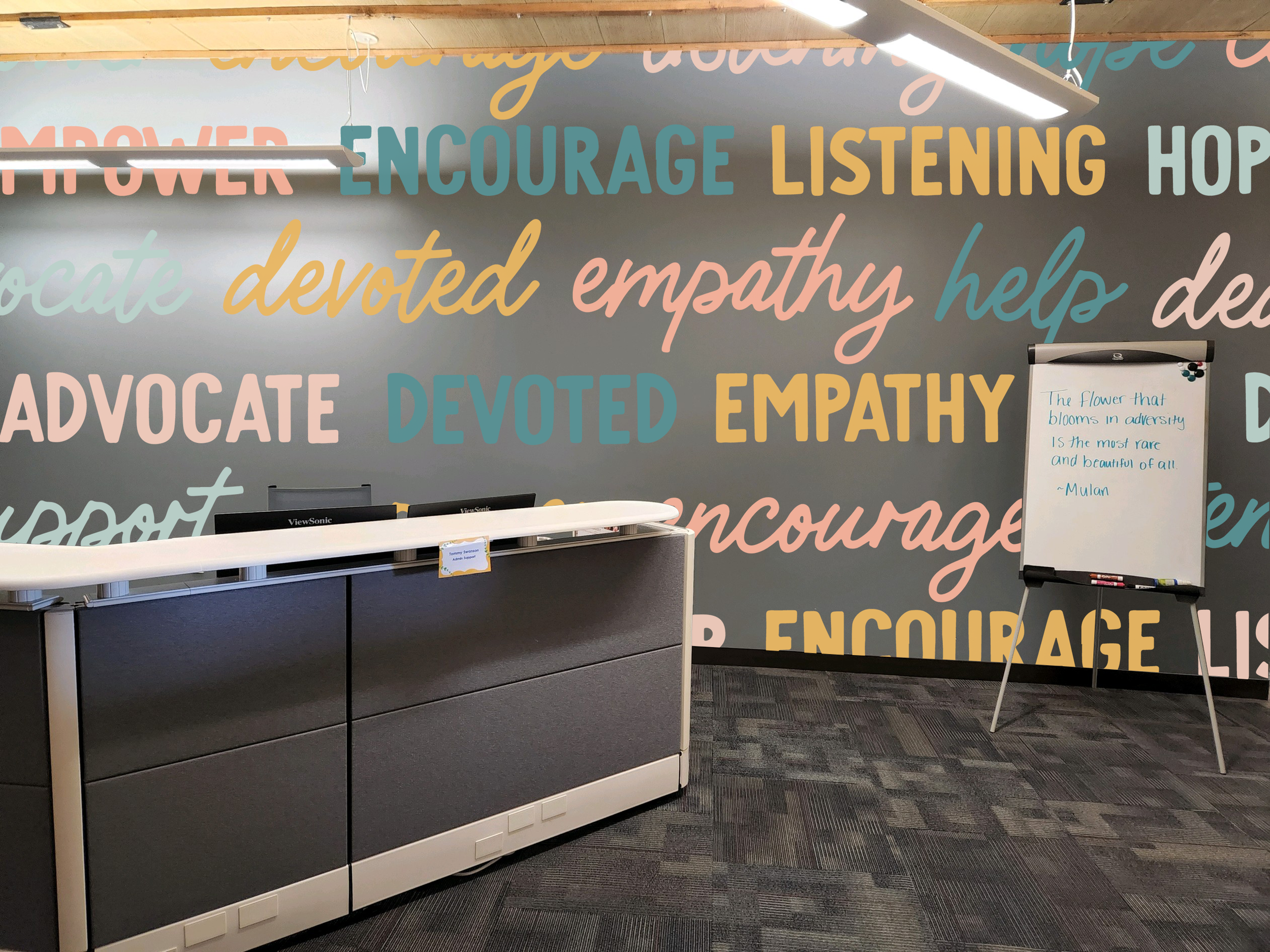
The second was my play on “graffiti tags.” I’m not a graffiti artist, so I didn’t want to straight up steal from that community and create a painted version of a “tag.” Besides, that seemed to really juxtapose the calming vibe they wanted (and not in the good way). Instead, I chose a few different words from a number of the team-created art that lines the office walls. I picked a scripted hand-lettered typeface and paired it with a bolder uppercased san-serif to balance feminine and masculine energy. The color palette - a rich and lighter teal, a deeper and lighter peach, and bold yellow, also play on that same energy balance.
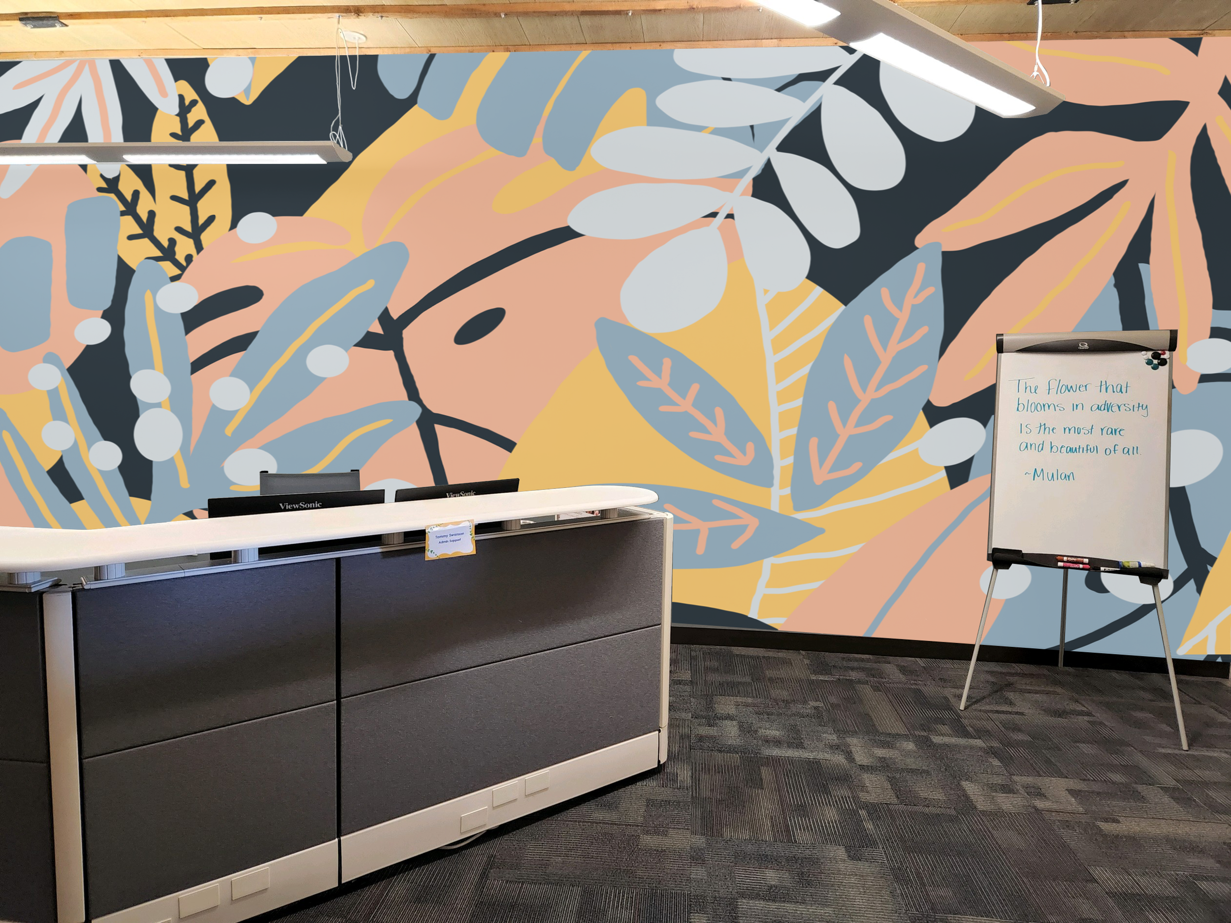
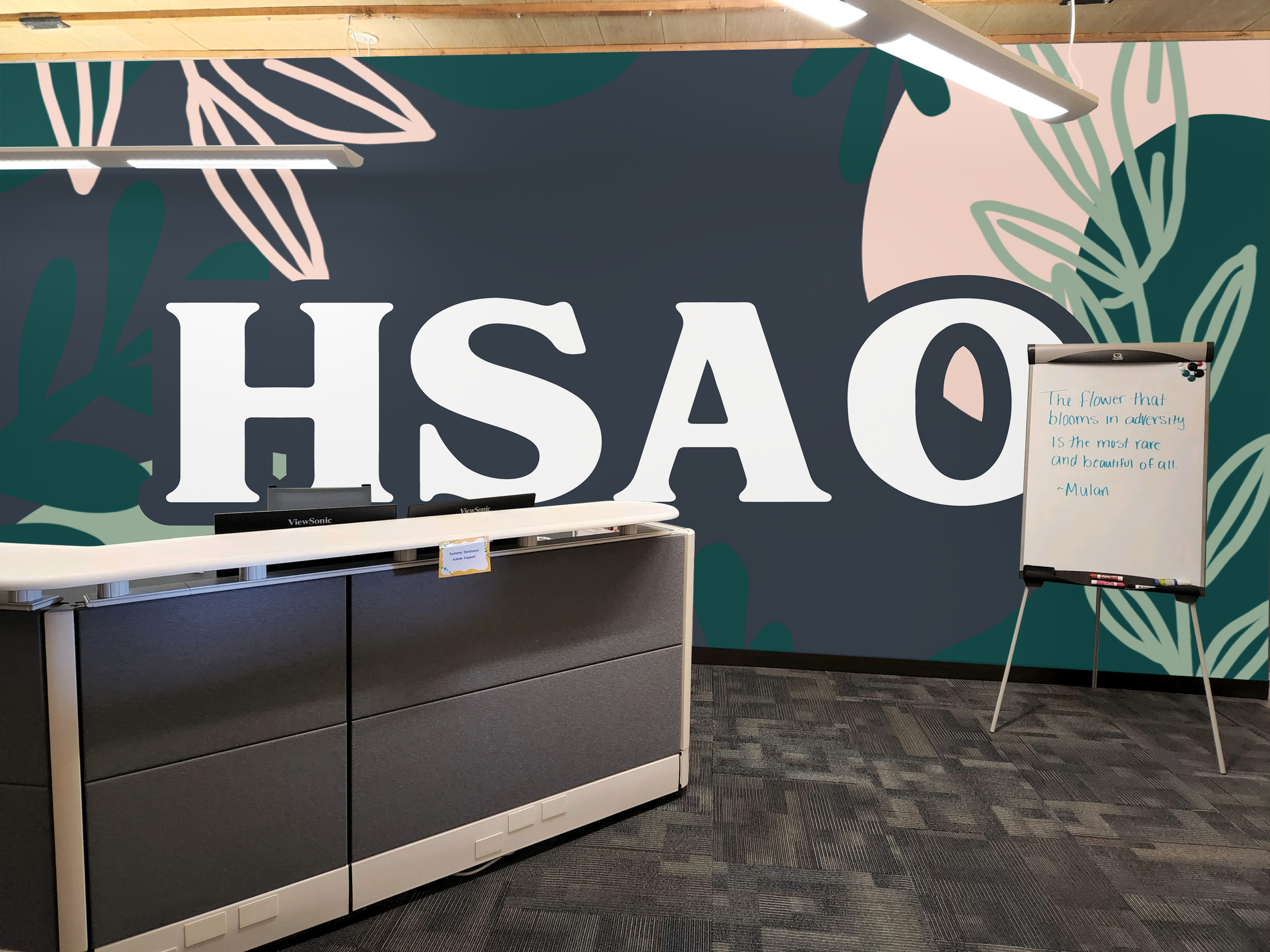
The third concept was a full plant wall - again, trying to keep the balance of masculine/feminine/neutral in pinks, blues, and yellows. Just plant leaves, no florals or flowers, and some spots and dots. And the fourth concept was a play on the third, but on a much more minimal scale, paired with the HSAO letters. I wanted to play with two tones of green and a light peach for this color palette and really embrace the original steel color of the wall.
Decision & Final Reveal
While the team did have a chat with some differing opinions, the overall consensus was the fourth concept. And they actually loved it so much that they really didn’t want to change much about it. We made the HSAO letters a bit smaller and spaced the items out for balance once we had the design chalked on the wall, but otherwise, it’s the same. Of the four, I do admit this one was my favorite (and the one I thought they would end up choosing). The second concept with the words was their second choice, and in that presentation meeting, we may have discussed enacting that in another space - but we’re going to focus on and be continually grateful for this current mural first!
This is the biggest wall I’ve gotten to get my hands on yet, and I’m so hopeful this is just part of the beginning. What might be the coolest and most full-circle thing about this project is that as I was packing up and getting ready to leave, an employee that I’d never met before came over and told me how refreshing the mural was.
I think that means I did my job well, right?
Have you been wanting to get more color into your life, your office, or your home? I’d love to help you get out of your head and into the joy of your space. Lets live in more color!
Until next time friends,
