
The Solidarity Center
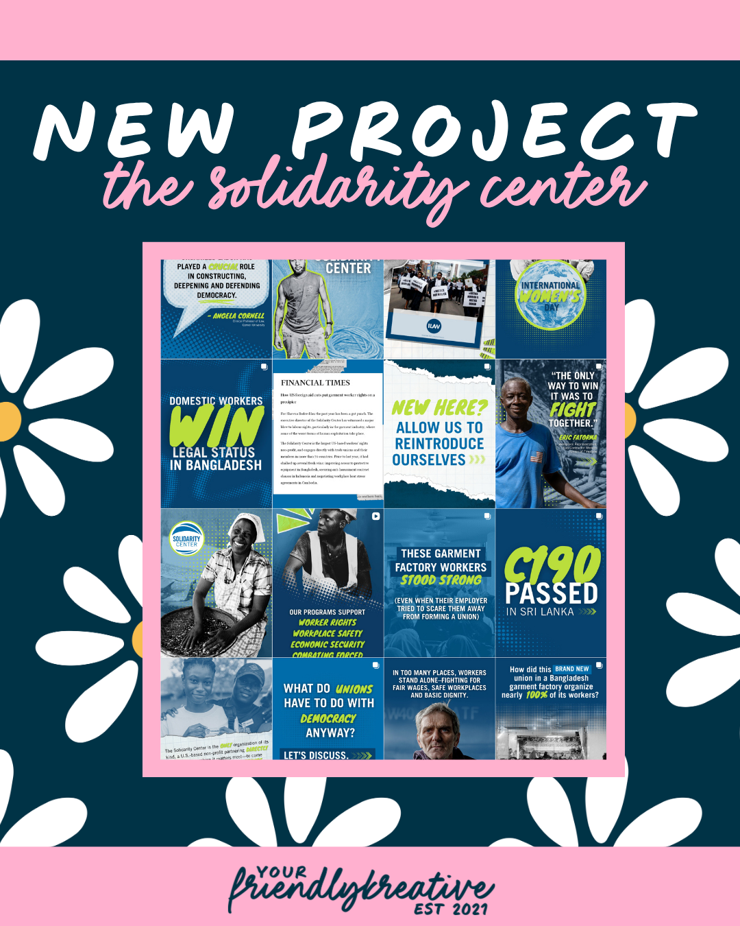
A Brand That Feels Like the People It Serves.
Reimagining the Solidarity Center’s entire global
visual identity, beginning with one international branch.
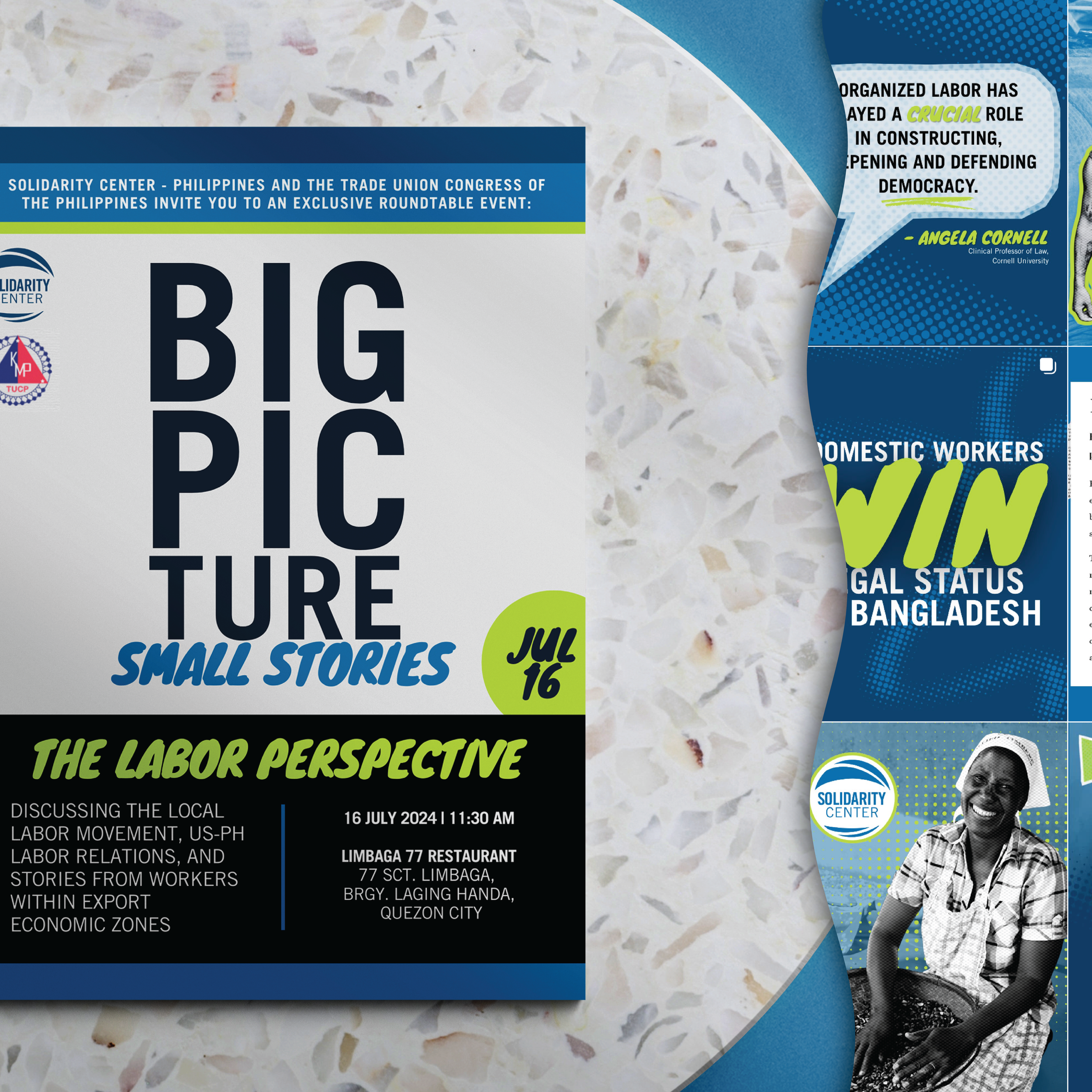
I was initially brought in to revamp the color palette for the Philippines branch of the Solidarity Center (a U.S. nonprofit that partners with workers and unions to advocate for workers’ rights worldwide). The goal was to create something that felt more aligned with the people, energy, and culture it represents, while still sitting recognizably within the broader organization. But as we began exploring that work, something became clear: this wasn’t just a regional issue; it was a global one.
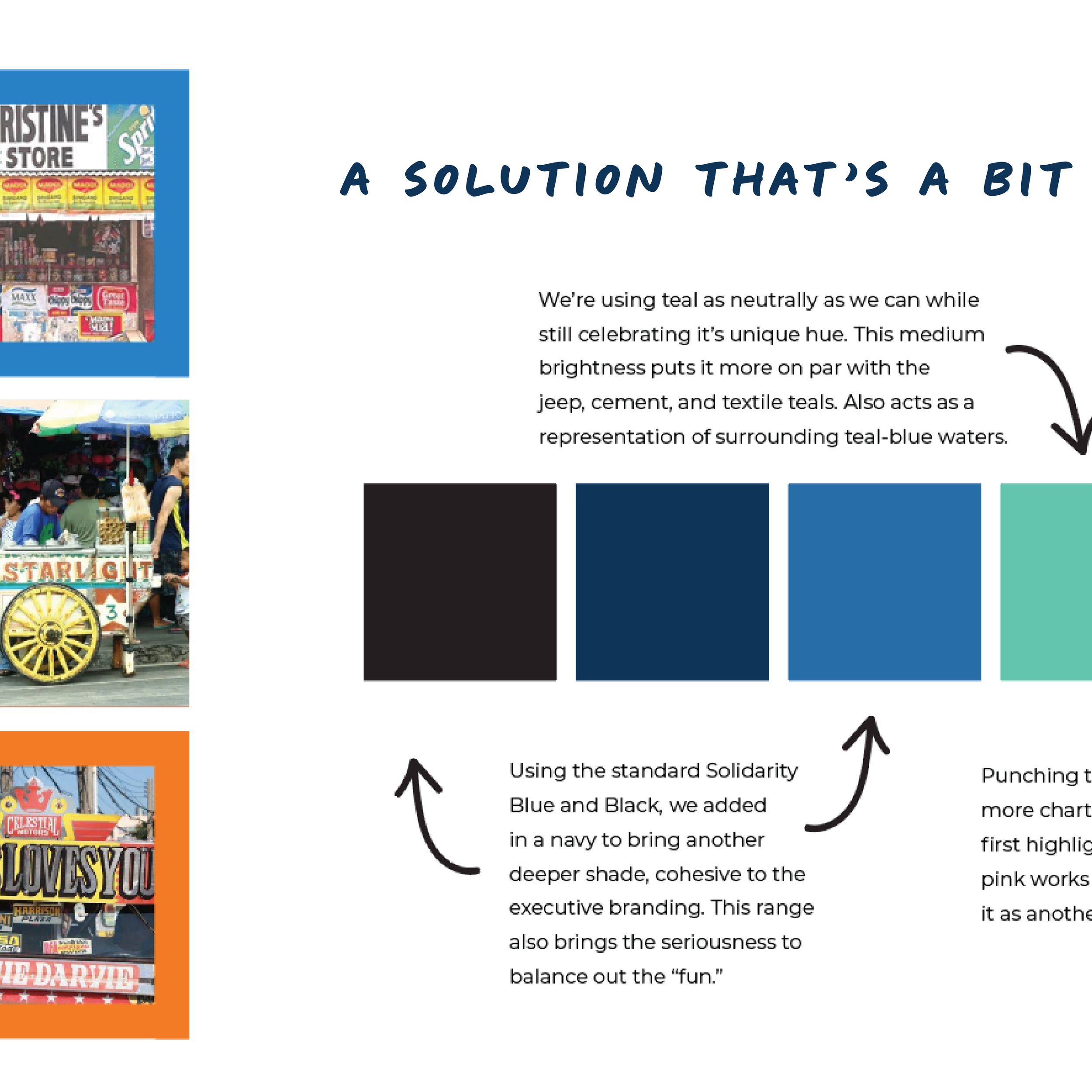
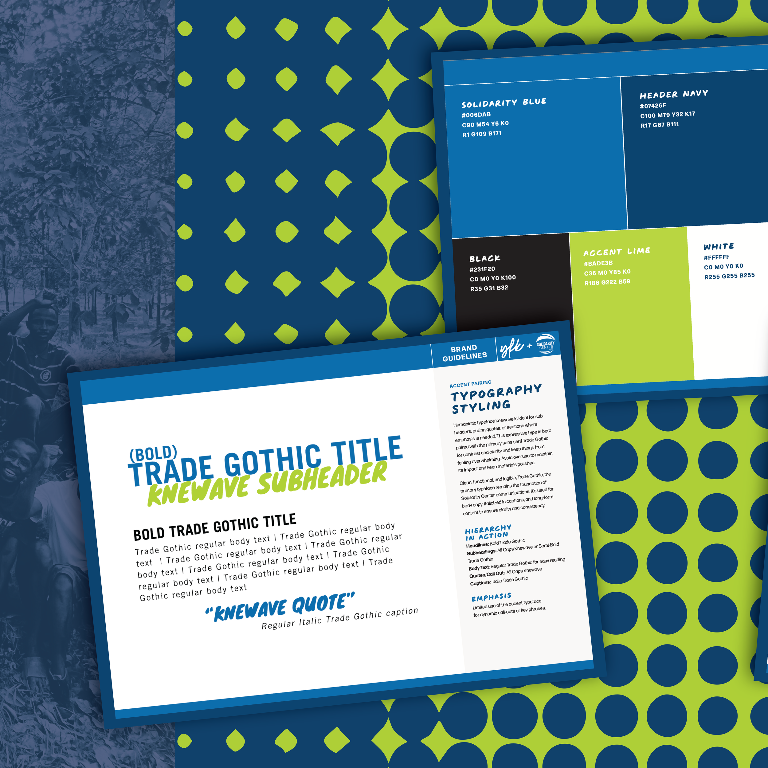
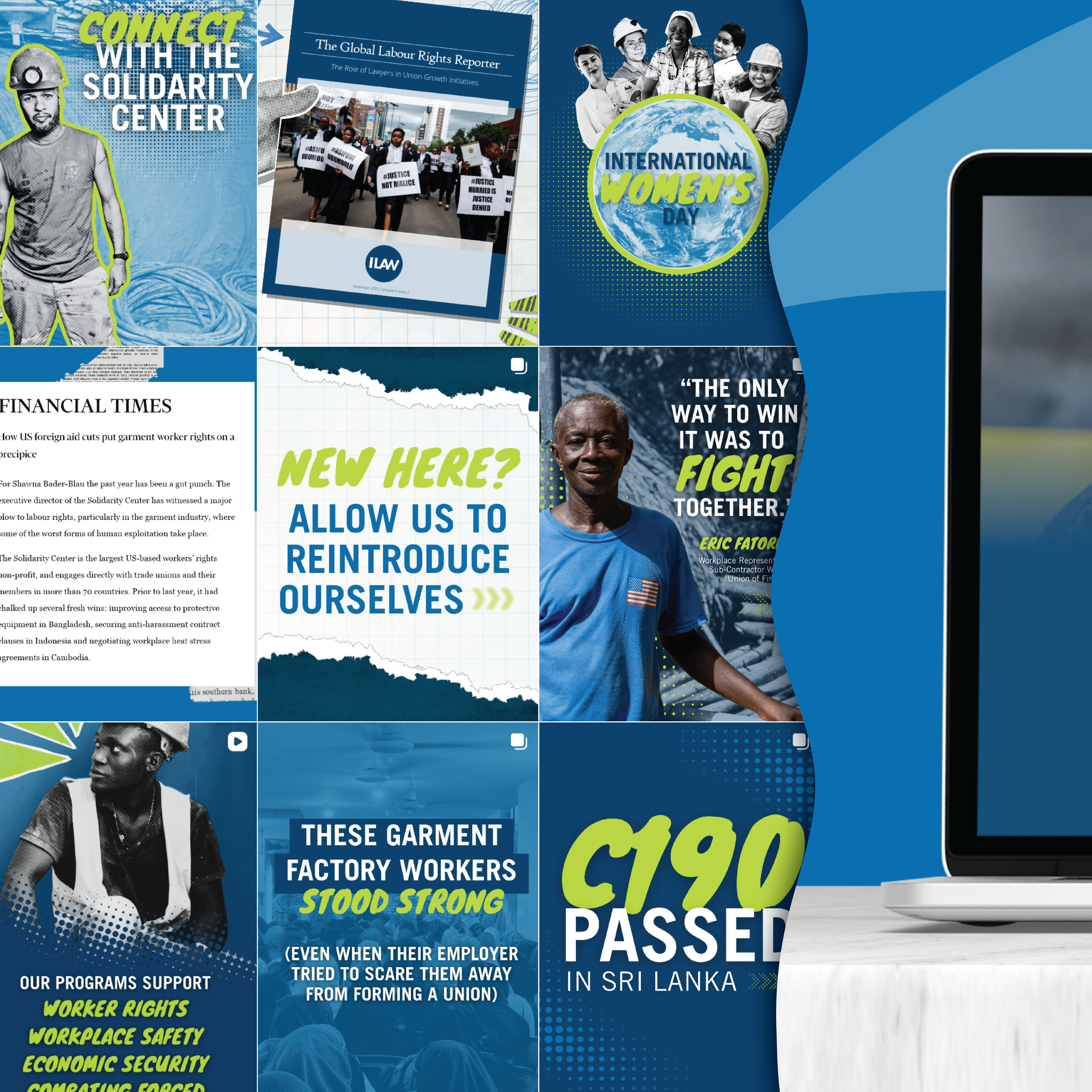
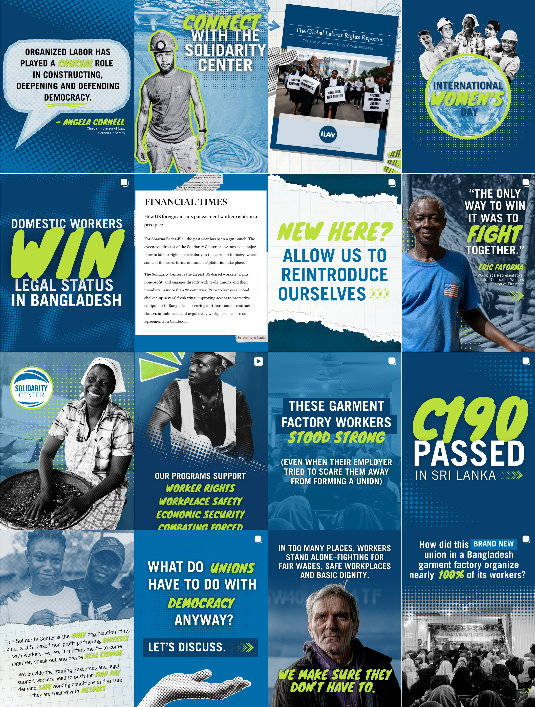
From there, the scope expanded into a full brand refresh across the entire organization. Together, we moved from a scattered, overly broad palette of blue, navy, orange, yellow, red, black, and white, to something far more intentional and cohesive: “Solidarity” blue and navy as the foundation, supported by an electric green, black, and white.
Alongside color, we introduced an accent typeface to bring warmth and humanity (and some fun energy) to the brand, developed brand guidelines, created social and infographic templates, supported website updates, and even extended into a design consulting retainer that involved training an internal team member and building long-term sustainability within the organization.
This wasn’t just a visual update.
It was about aligning the brand with the mission.
Setting Up the Strategy
Like every project, we started with the foundation. The question wasn’t just what should this look like? It was: what is this brand trying to feel like, and why isn’t it getting there right now? At its core, the Solidarity Center exists to support workers, advocate for human rights, and empower communities across the globe. But the existing brand identity felt… disconnected. Too corporate. Too clinical. Too distant. Too much like the organizations they were fighting. And when an organization rooted in human connection looks impersonal (or like the enemy), it creates friction. It can unintentionally communicate the exact opposite of its mission.
So the strategy became twofold:
1. Create a cohesive global system: A unified brand that feels consistent and recognizable across all regions.
2. Build in intentional flexibility: Allowing each region to visually reflect its own culture, people, and environment, without “losing the plot.”
This is where color became the anchor.
The Palettes
The Philippines: Where It All Began
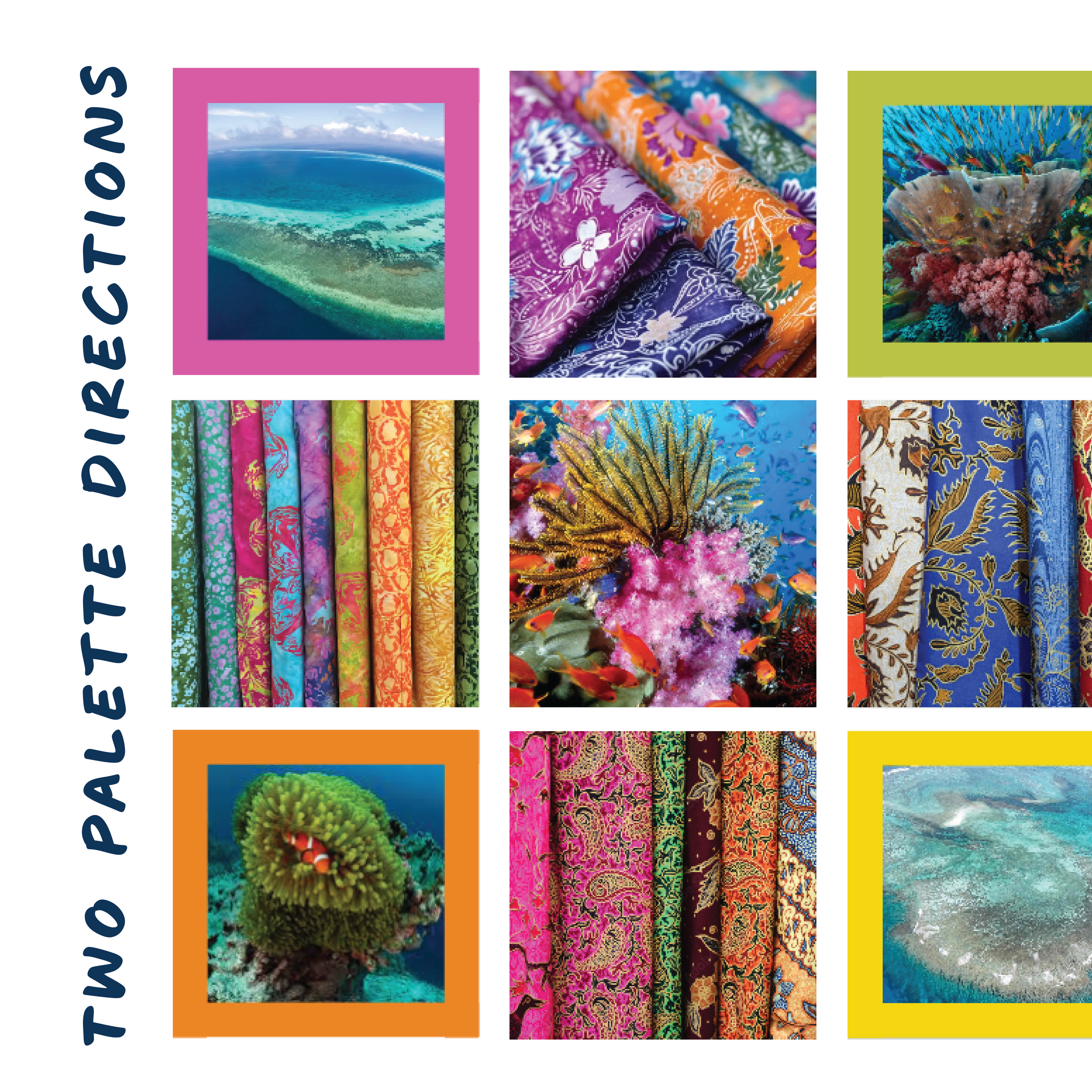
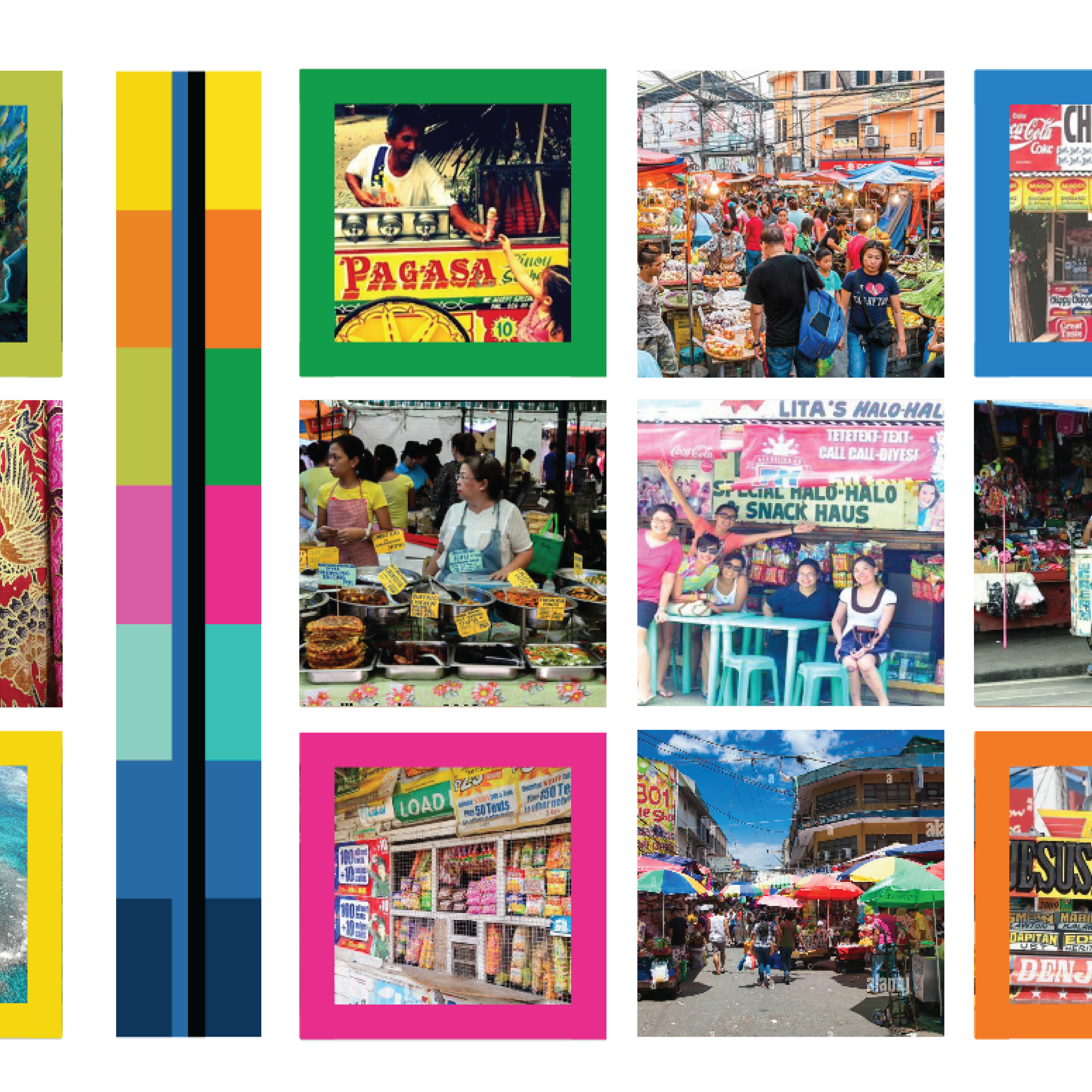
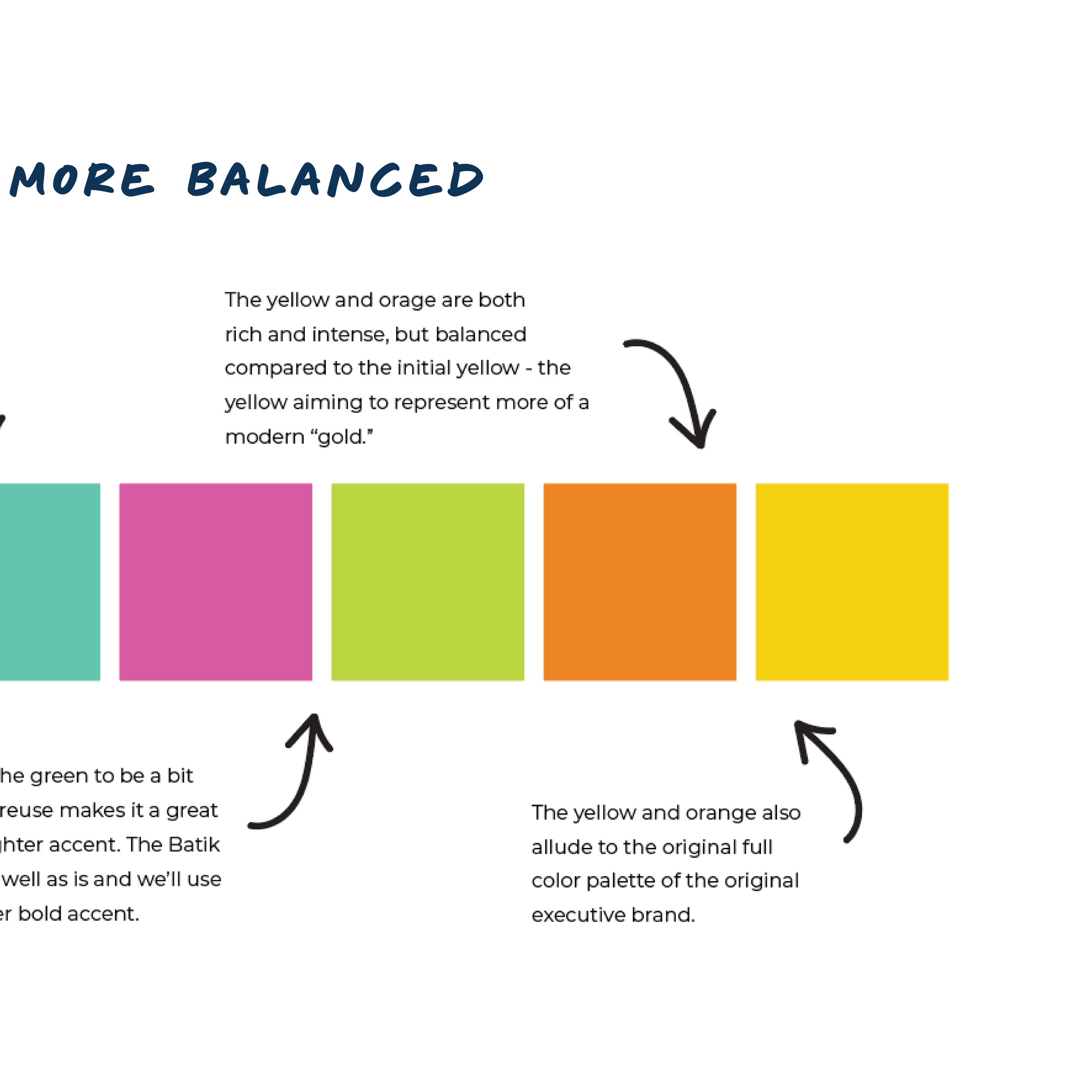
Color is not just aesthetic, it’s emotional, cultural, and deeply human. In a global organization like the Solidarity Center, color does more than decorate; it represents people. For the Philippines branch, the palette needed to balance two things. 1. The bold, dependable foundation of the global organization. And 2. The vibrant, spirited energy of Filipino culture. The result was a palette that emphasizes vibrancy & energy, trustworthiness, a “get the job done” mentality balanced between seriousness and joy, unity & connection, and last but not least, empowerment.
It speaks to progress and strength, while still celebrating the richness of the culture it represents. And that thinking became the blueprint for everything that followed.
Building the Global System
From there, we expanded the idea into a scalable brand strategy:
A core global palette (solidarity blue, navy, electric green, black, white) acts as the foundation, used in high-level communications and widely visible platforms.
Then, regional sub-palettes allow each branch to reflect their own cultural context.
This creates a system that is:
Consistent (same logo, same type system, same structure)
Flexible (color adapts to region)
Collaborative Source of Pride (regions can help shape their visual identity…and be proud of it!)
It also opens the door to deeper engagement, inviting local teams to contribute to their palette, drawing on cultural symbolism and lived experience. Because color isn’t universal. It carries different meanings, histories, and emotions depending on where you are. And honoring that matters.
The Missing Piece: Humanity in Type
While color created structure and expression, typography solved a different problem, the problem of connection. The existing type system was functional, but it leaned heavily corporate. So we introduced an accent typeface designed to bridge the gap. It’s rounded, bold, and slightly reminiscent of a handwritten marker, bringing in a sense of immediacy and humanity without sacrificing professionalism.
This addition created:
Connection: It feels written by people, for people
Vibrancy: It adds energy alongside the color system
Balance: Human, but not informal
Versatility: Neutral enough to work across cultures
Used intentionally, for headlines, quotes, and callouts, it becomes a powerful storytelling tool within the brand.
The Update: A New Visual Language
With color and typography defined, we moved into building the full visual system. The guiding direction? Somewhere between a grassroots zine and The New York Times. Our goal was a balance of “credible, informed, and trustworthy” PLUS “expressive, human, and alive.”
Once this direction was approved, I then developed:
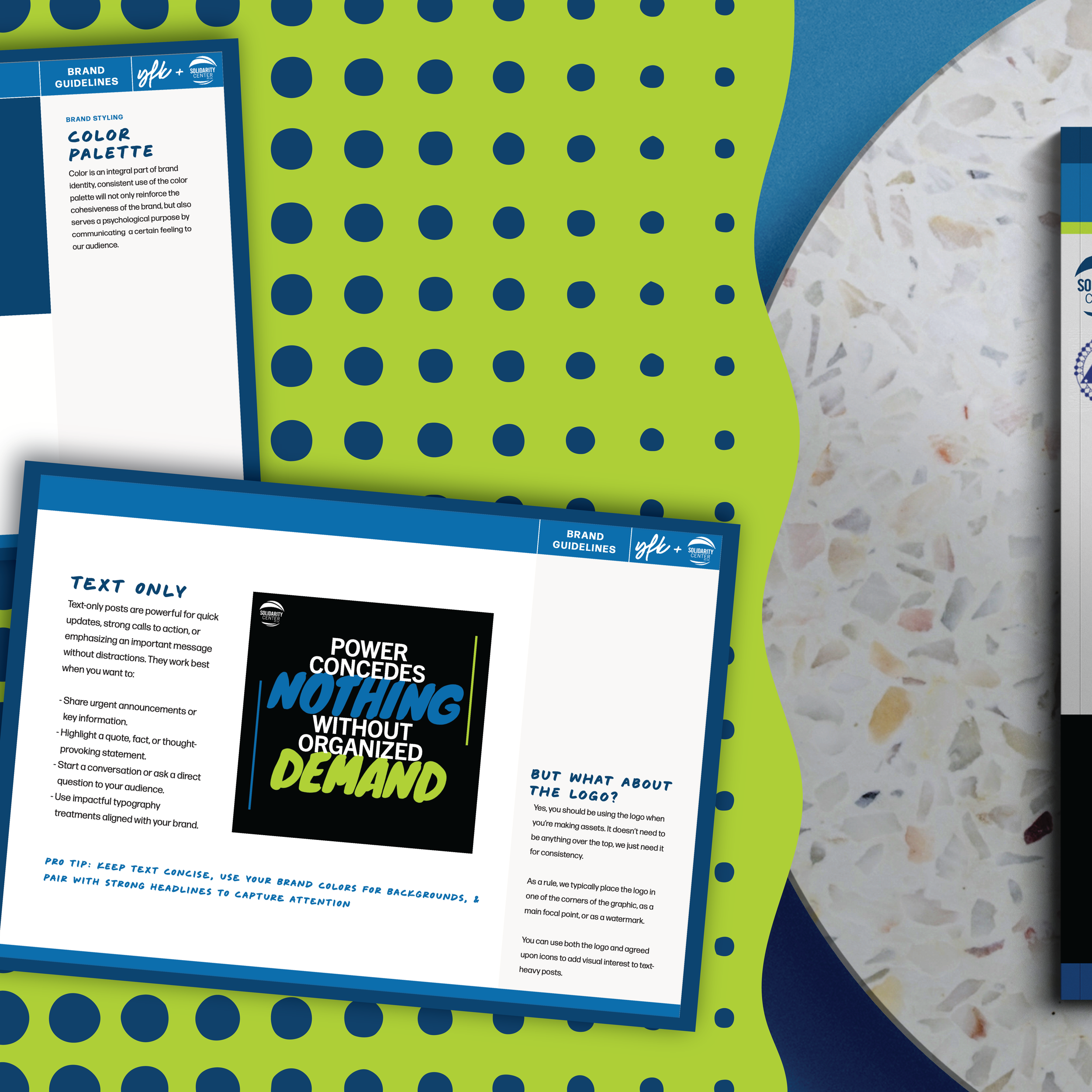
A full brand guidelines document
Social media templates (built directly in Canva for accessibility)
Infographic layouts for education and advocacy
Marketing collateral examples (posters, mailers, etc.)
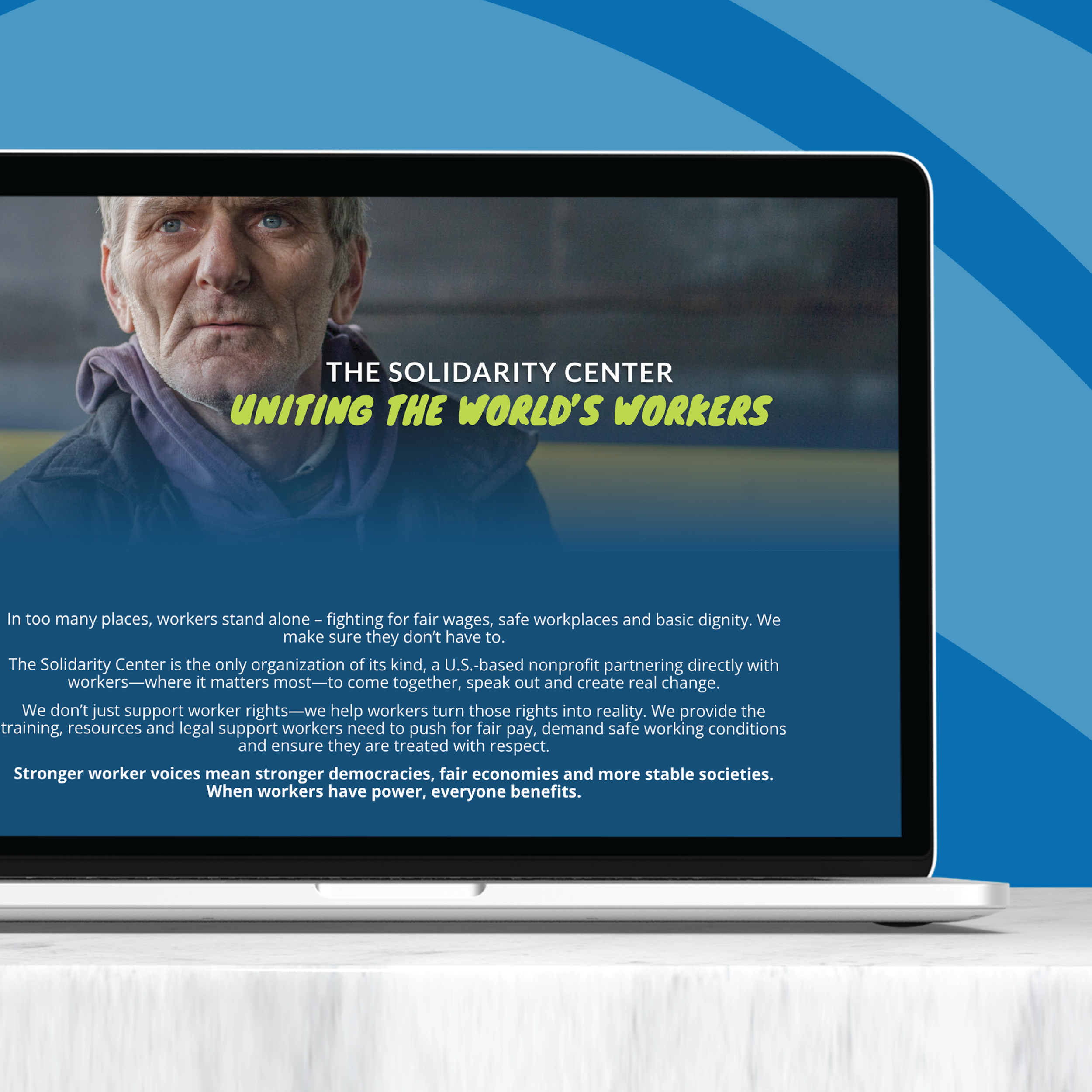
Landing page updates to bring the digital experience in line with the new brand
Every piece was designed not just to look good, but to be usable, repeatable, and sustainable for the internal team.
Beyond the Deliverables
Building Internal Capacity
One of the most meaningful parts of this project extended beyond design. Through a retainer partnership, I worked directly with a team member to help her learn, implement, and troubleshoot the brand in real time. We navigated Adobe software together, problem-solved active design challenges, built confidence in applying the system, and even created assets and shortcuts to save time and resources. It was a fun way not just to flex some old muscles, but it was honestly a great reminder that I do actually know what I’m doing because I’m able to help someone else understand and do it on their own. How cool, right?
Where We Landed
Because a strong brand isn’t just about what’s created, it’s about what can be carried forward.
The final result is a brand system that feels:
More human
More connected
More reflective of the people it serves
More scalable across a global organization
It doesn’t just communicate information; it builds something bigger, trust. And in a space rooted in advocacy, justice, unity, AND community…that trust is everything. This project is a reminder that branding isn’t surface-level. That it’s not just colors and typefaces/font families. It’s about strategy and alignment. It’s gaining clarity. It’s making sure that how you show up visually reflects who you actually are.
And when those two things match? That’s when a brand becomes powerful.
