CaregiversNW: Rebrand

Circle [sur-kuhl] verb,
cir·cled, cir·cling
to enclose in a circle; surround; encircle.
to move in a circle or circuit around; rotate or revolve around.
Today, we’re talking about one of my favorite topics: rebranding. Rebranding can be controversial, as it risks alienating your original audience. But while rebranding is risky, the reward that comes when you do it correctly is more than worth the investment. Rebranding isn’t about jumping on a new trend so you can sell more, rather rebranding is about evolving WITH the business, with yourself. We as humans don’t stay stagnant (you may try to dig in your heels, but change and evolution are inevitable), and neither should your business.
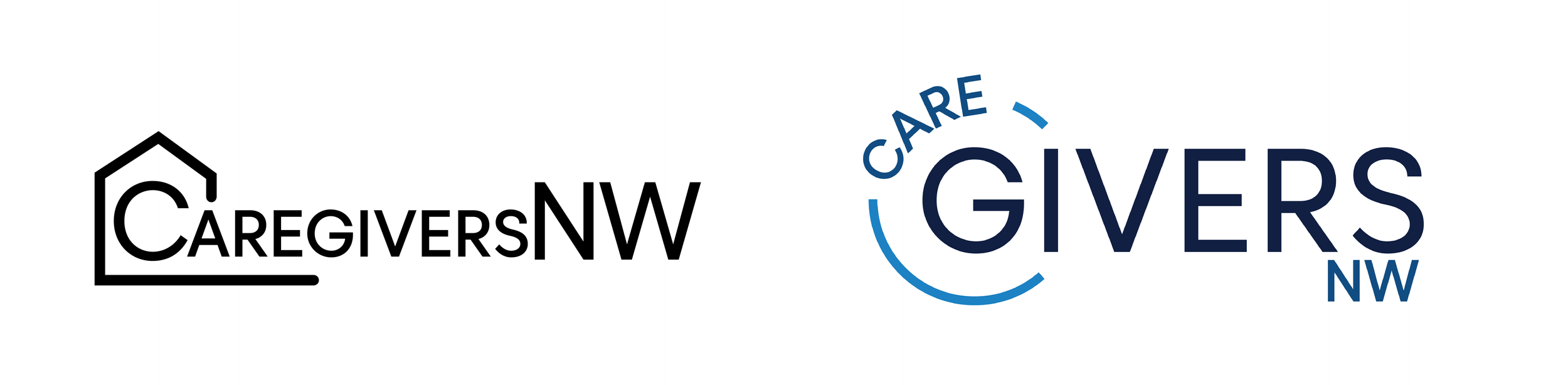
CaregiversNW (CGNW) came to me with a website and a “look.” I use the word look because zero brand standards had been established other than a basic primary logo. They had a typeface they used for their logo, but it wasn’t used for anything else. No set colors, no set illustration style, no icons or patterns, no photography style - nothing that visually tells the audience this thing they’re looking at is tied to CGNW. Unfortunately, the choices that had been made for the site seemed to have no meaning. Colors were picked for the hell of it (teal, green, and…orange?). Illustrations were picked willy-nilly - none of them matching in the same style. The copy was basic. The photos were stock. There was nothing about this caregiving website that told you care was taken in its own creation - and as a brand developer, I think that’s a HUGE problem. How will you convince your audience you provide great care to them when it feels like you’re rushing through your own business components? (And yes, I say that and immediately start to cringe thinking about the ways I’ve been hypocritical in showing up for my own business. But I mean, hey, this blog is an attempt at carving time to do just that - I’m trying to evolve here, too, people, haha.)
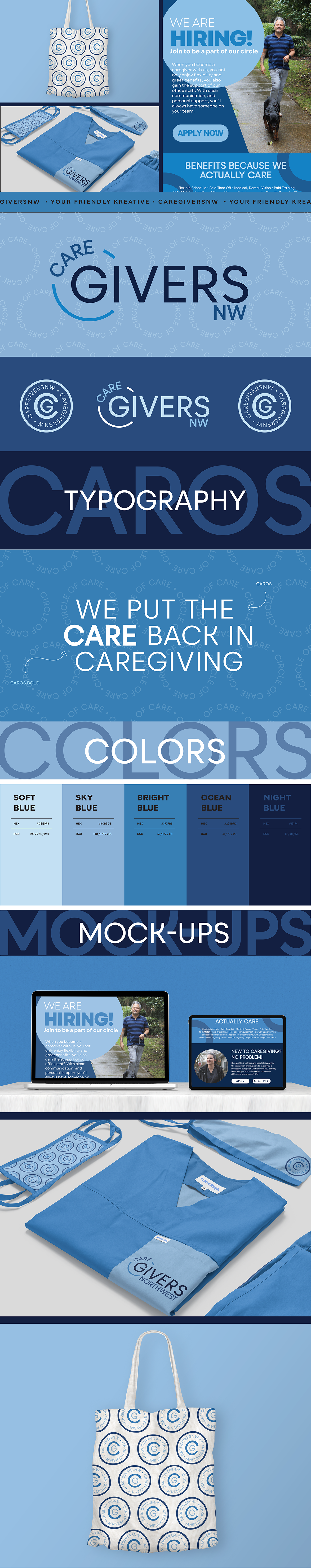
So what did we do? We played the 90’s makeover montage game and got super clear, direct, and infused soul back into their messaging (shout the incredible Connie Mabin). By identifying things like the brand’s tone of voice and determining how we want others to feel and take away when they work with us, we were able to create a brand that felt cohesive and welcoming. The team and I felt it was important to keep at least one original “look” choices to try and keep a bit of cohesiveness between the original brand and the updated version. So we kept the original typeface. We picked an ombré blue color palette that feels bright and energetic while still leaving room for more “neutral” light and darks to balance with calm. The phrase “the circle of care” is something we kept coming back to, and so, of course, we needed to establish circles as one of our graphic themes. Instead of the original house, the new logo is wrapped in literal “care.” I wanted to highlight the word GIVERS because that’s what they do; these people give of themselves to show up for those who need help the most.