
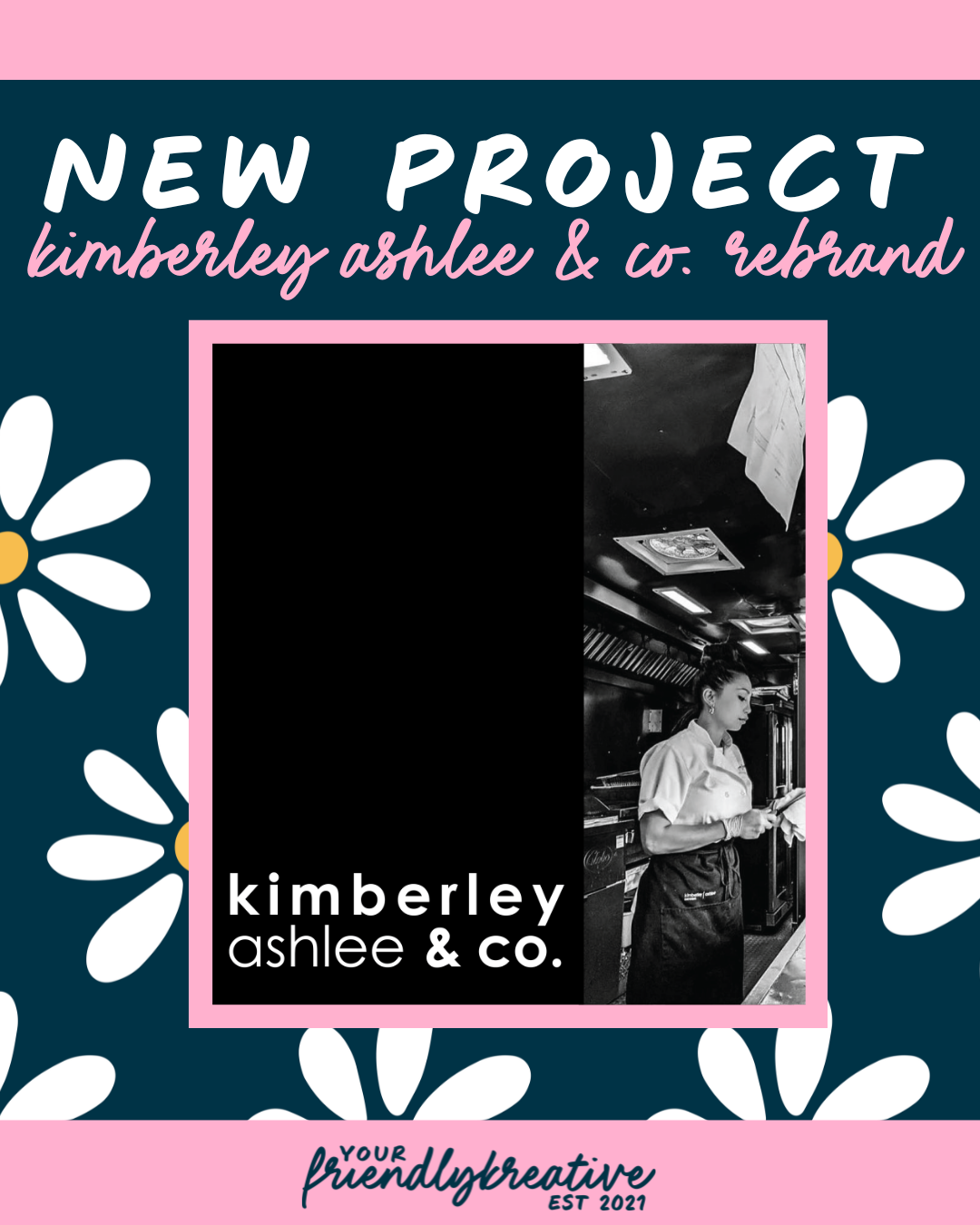
Kimberley Ashlee & Co.
Where contemporary meets creative, every detail tells a story.
Kimberley Ashlee & Co. isn’t new to excellence, but this rebrand marked a new era for the established catering and hospitality company. With years of experience serving the Pittsburgh region through luxury events, restaurants, and private dining experiences, Kimberley was ready to evolve the brand to match her next chapter: one that pairs high-end catering with culinary consulting on an international scale.
The unique challenge? Designing a new visual identity for a catering brand that could confidently coexist alongside another Pittsburgh catering staple I had just rebranded, while ensuring the two felt worlds apart. Luckily, that distinction came naturally once we dove into the brand strategy. Monteverde is about warmth, heritage, and family; Kimberley Ashlee & Co. is about polish, perspective, and partnership. Both serve food, but they serve entirely different experiences.
A Strong Foundation & Choices that Followed
We built the foundation of Kimberley Ashlee & Co.’s new identity around the idea of “contemporary meets organically innovative.” The brand needed to convey professionalism and elegance, but with a hint of curiosity and the spark of creative, hands-on energy that Kimberley brings to everything she touches.
The typography became the visual anchor. We paired a clean, geometric sans-serif, used in regular, bold, upper, and lower cases, to establish structure and confidence. Against it, we layered hand-drawn sketch illustrations inspired by glassware, table settings, and seasonal foods, creating a sense of artistry and motion. The final touch came in the accent type, a script reminiscent of handwriting. It mirrors Kimberley’s habit of jotting notes during meetings, menus, and calls, a small but meaningful nod to her personal process and attention to detail.
Color-wise, the black, white, and beige palette strikes a balance between timeless luxury and modern restraint. The palette speaks directly to the elevated clientele Kimberley aims to reach: the hotel chains, international partners, and event professionals who value refined simplicity and excellence over excess.
Together, the visuals embody a refined duality; structured yet soft, professional yet personal. A visual story that could only belong to Kimberley Ashlee & Co.
A glimpse into the reimagined Kimberley Ashlee & Co.


Rebranding is a Sign of Growth
This rebrand wasn’t just about creating something beautiful; it was about crafting a visual identity that could grow with the business. One that feels as confident in a local Pittsburgh event space as it does on an international consulting stage. Kimberley Ashlee & Co. now embodies the same principles that define their work: creativity, collaboration, and culinary precision, all delivered with elegance and heart.
every dish deserves a story, & every story deserves to be experienced.
Check out the Kimberley Ashlee & Co. website!