
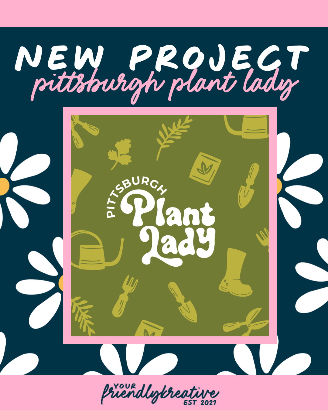
PGH Plant Lady
“Sometimes growth means outgrowing the comfort of where we started.”
Every brand reaches a crossroads where it has to ask a hard but exciting question: Do we stay rooted in what feels comfortable, or do we grow toward the light of what we’re becoming? For the PGH Plant Lady herself, Rachel, this brand evolution started with color. Ironically, it was the use of color in my branding that led her to want to work together. We specifically were faced with the challenge of choosing between a softer, grounded, familiar palette that reflected where the brand began and a more saturated, bolder one that represented where it could head. The journey that followed wasn’t just about design; it was about stepping into new soil and trusting the process of blooming into something fresh, vibrant, and full of life.
Setting Up the Strategy
Creating a nature-focused brand that is both joyful and grounded requires balance. A little bit of earthy calm here; a touch of wild color there. With PGH Plant Lady, the goal was to capture the authenticity of the brand’s roots while reflecting the energy of growth and expansion. Drawing from years of experience building fun, approachable brands centered around connection and education, I knew this palette had to feel like sunshine and soil at once: bright enough to inspire curiosity, but organic and rich enough to nurture a lasting presence.
The result was a spectrum that bridges nature and nurture, tones that evoke the warmth of the sun, the optimism of blooming petals, and the bright greens of healthy growth. Together, these colors tell a story of a brand that doesn’t just exist in nature, but is nature. It’s a palette that’s joyful, invites people in, and encourages them to get their hands dirty, both literally and creatively.


Blooming into Life
From the start, this brand needed to feel alive, like a garden mid-bloom. The use of a retro-inspired accent typeface nods to nostalgia, echoing Rachel’s style and memories of gardening alongside her grandmother. (Plus the retro vibes are also reminiscent of the “flower power” era). The mix of organic shapes and natural textures reflects her hands-on approach to education and community-building, with her ultimate goal being to eventually host hands-on classes and weekend retreats. Rounded illustrations and graphic elements were designed to feel playful yet purposeful, reflecting her love for teaching others how to grow, experiment, and connect back to nature.
The color story reinforces that same idea of balance: fresh and modern, playful and full of life. Together, the type, color, and illustration system form a brand that feels approachable, empowering, and joyfully authentic, just like Rachel herself.
In Full Bloom
PGH Plant Lady’s look isn’t just a fun color story; it’s a reflection of the cultivation of hard work in bloom in every sense. It’s about trusting that when you plant new seeds, something beautiful will always emerge. There are always beautiful fruits to your labor; yet in order to harvest the most delicious fruits, the labor has to be consistent and intentional. This rebrand reminds us that nature’s best work happens when we let things evolve, and that sometimes, the most powerful transformation begins with a single, brave decision to bloom in a new direction…
…perhaps, finally, to fully bask in the sun, like you’ve always deserved.