MaddyCakes Bakes: Brand Reveal

embracing the values of warmth, hospitality, & empathy, making every customer feel like family
Although this is a branding reveal, I’m stepping back into my “dance teacher” shoes to begin this blog. Part of what I love about teaching dance, specifically, is that unlike educational schooling, I get to work with the same kids season after season for as long as they dance until they graduate high school. And as I’m now in my ninth season as a teacher, I’m realizing how long that time actually is. To say that I’ve been working with a few students now for almost a decade feels wild, but more than anything, I’m so grateful to have an opportunity to make a long-standing, hopefully positive, impact.
One of my students in particular has developed a passion for baking - well, the passion was always there, but rather, she’s been refining her skillset quite impressively over the last few years. And recently, she’s been taking big steps to make her baking dreams a reality in a career-oriented sense. Not only is she pursuing pastry and business at the collegiate level, but she’s been selling her bakes within her local community. She created her business name, created a base logo, and began a social media account to show her portfolio and market her menus. I’ve been so impressed watching her lean into the things she loves and putting in the hard work to co-create the life she wants (not to mention figuring all this out at the age of 17 - whereas I only began “figuring it out” in my late 20s and early 30s). So, as a part of her graduation gift - as I’ve been trying to do something special for all of our graduating classes - I wanted to help her set herself up for success with a full brand strategy and visual identity.
Per every branding project, we started with the brand exploration, where we dove into the six pillars of branding strategy. The strategy we set - which covered everything from the business culture and ideal clients to tangible impact and the feelings she wants clients to be left with. It’s the answers to these questions that actually inform what the visual identity (i.e., color palette, typography, logo, and icons/patterns) ultimately looks like. To be clear, I do consider the client’s design preferences, as I want them to love their branding more than anything, but I’m not using those preferences as the ultimate deciding factor. We jumped between a few different color palettes, for example, as we wanted to honor this student where she is now but also who she wants to be in the next 5 - 10 years. It’s these types of big-picture and small-detail questions that really make all the difference in creating an aligned brand.
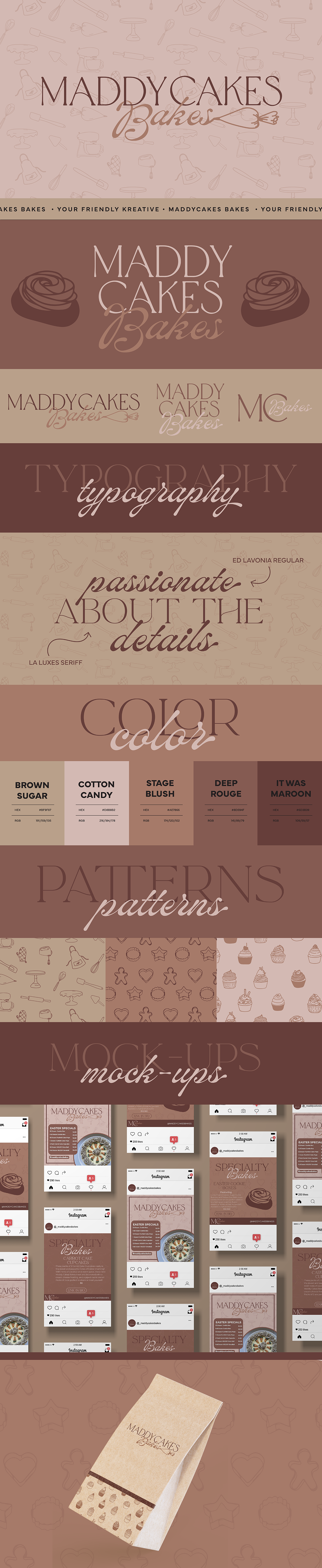
So enjoy the reveal of MaddyCakes Bakes. I adore this visual identity and am so excited to see all the things to come from both it and Maddy. The logo consists of paired typefaces, an elegant feeling script (that highlights the boutique style business she wants to have in five years), and a “juicer” script mimicking icing calligraphy (and a nod to the fun that underlies the culture). The primary logo literally pipes the “Bakes” portion of the name, while the secondary logo simply shifts and aligns it below for a more stacked variation. The submark capitalizes on the MC of MaddyCakes and shrinks the scripted “Bakes” into the C. Maddy was torn between a neutral and colored palette, so I met her somewhat in the middle. I took a muted blush tone she really liked, punched it darker as well as lighter, and added a brown sugar color to round out the neutral theme (I’m a big “dark colors are neutrals” kind of gal - navy, maroon, deep olive, etc.).
In regard to graphics, we went a little wild, but I honestly couldn’t help it and wanted to give a few of her offerings their own patterns and icons. Cookies and cupcakes are Maddy’s bread and butter, so I wanted to give those two types of treats their own patterns. Maddy also creates pies, full cakes, rolls, and more, so I concluded the patterns with a final “all things baking” theme featuring all sorts of tools. The last parts of the identity are a few icons specifically designed for a few of Maddy’s signature items: a red velvet cookie, chocolate-covered Oreo balls, and holiday cookie trays.